Project 4
Title: Trust
Poster Trope: Big Eye
Genre: Thriller
Task C:
Posters I do not like:


Task D:
Guardians Of The Galaxy recreated poster:

Task E:
Group of six mates go to a ski lodge in Switzerland for a week. On their third night there they start to receive texts from an unknown number which gives them the option to reveal a dark secret of theirs or to kill/hurt someone. There is no way of getting help from anyone as they are threatened if they do and there is no where to run to as the lodge is in the middle of no where. At the end of the film there is only on person is alive and the person messing with them all lets him go but is arrested by the police as he cannot prove someone made him kill his friends.
List of elements for poster:
Title
Credits
Actors
Release date
List of props and costumes:
None
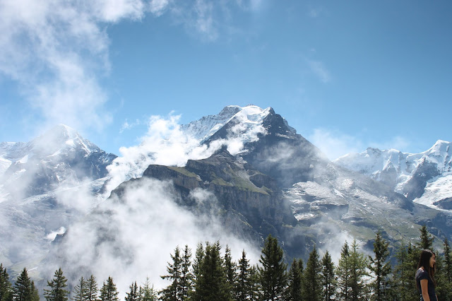
List of locations:
Switzerland
Class room
Fonts to be used:
Copperplate
Theme Colours:

Mockup poster:

Task F:
The feedback i received from my peers was that I should change the font of the film title. They thought it didn't stand out enough as it is basic. They also said the eye should be shown on a person not just by itself as it didn't look interesting to look at. The changes I'm going to make to edit my poster is too find a font that is unique and to use a photo of an eye showing it is on a person.
Task G:


Task H:

Task I:
The feedback I received from my peers were very negative. I was told the photo of the eye didn't have much detail in it as it is poor quality. I was also told it looks really dull with not much colour in it. So I have taken these comments on board and I am going to make the eye look more defined. I am also going to make the poster more colourful so its more eye catching.
Task J:

Task K:
What makes your poster standout? - The title Trust stands out in this poster because it is in bold and in a large font. Another reason its stands out is because the dark colours in the background make the white colour in the title look more bright resulting it to stand out more. I also think the red at the bottom of the poster stands out because the colour red symbolises fire, emergency, danger etc. This makes the viewer draw their attention to it which will make them read the title, release date ad credits as they are places over that colour.
What are some elements you want to improve on? - The element I would like to improve on is the font of the tagline and release date. I think I could've found a more unique font that will make my poster standout to others.
What changes to your workflow could you make in future projects to improve your outcome? - I would change my workflow by sticking to the schedule as I had to rush when editing my poster because I was running out of time. This resulted in me not doing the best I can when editing it and I could've experimented with the tools more.
How did you improve your photoshop skills? - I improved my photoshop skills by experimenting with the brightness, contrast colour tool. This allowed me to recognise what looks good in a photograph. I also learned how to use the clone stamp tool which I used to select an area of the skin on the face and use it to cover up the eyebrow hairs.
Poster Trope: Big Eye
Genre: Thriller
Task C:
Posters I do not like:


Posters I like:


Task D:
Guardians Of The Galaxy recreated poster:

Task E:
Group of six mates go to a ski lodge in Switzerland for a week. On their third night there they start to receive texts from an unknown number which gives them the option to reveal a dark secret of theirs or to kill/hurt someone. There is no way of getting help from anyone as they are threatened if they do and there is no where to run to as the lodge is in the middle of no where. At the end of the film there is only on person is alive and the person messing with them all lets him go but is arrested by the police as he cannot prove someone made him kill his friends.
List of elements for poster:
Title
Credits
Actors
Release date
List of props and costumes:
None
List of locations:
Switzerland
Class room
Fonts to be used:
Copperplate
Theme Colours:

Mockup poster:

Task F:
The feedback i received from my peers was that I should change the font of the film title. They thought it didn't stand out enough as it is basic. They also said the eye should be shown on a person not just by itself as it didn't look interesting to look at. The changes I'm going to make to edit my poster is too find a font that is unique and to use a photo of an eye showing it is on a person.
Task G:


Task H:

Task I:
The feedback I received from my peers were very negative. I was told the photo of the eye didn't have much detail in it as it is poor quality. I was also told it looks really dull with not much colour in it. So I have taken these comments on board and I am going to make the eye look more defined. I am also going to make the poster more colourful so its more eye catching.
Task J:

Task K:
What makes your poster standout? - The title Trust stands out in this poster because it is in bold and in a large font. Another reason its stands out is because the dark colours in the background make the white colour in the title look more bright resulting it to stand out more. I also think the red at the bottom of the poster stands out because the colour red symbolises fire, emergency, danger etc. This makes the viewer draw their attention to it which will make them read the title, release date ad credits as they are places over that colour.
What are some elements you want to improve on? - The element I would like to improve on is the font of the tagline and release date. I think I could've found a more unique font that will make my poster standout to others.
What changes to your workflow could you make in future projects to improve your outcome? - I would change my workflow by sticking to the schedule as I had to rush when editing my poster because I was running out of time. This resulted in me not doing the best I can when editing it and I could've experimented with the tools more.
How did you improve your photoshop skills? - I improved my photoshop skills by experimenting with the brightness, contrast colour tool. This allowed me to recognise what looks good in a photograph. I also learned how to use the clone stamp tool which I used to select an area of the skin on the face and use it to cover up the eyebrow hairs.
Comments
Post a Comment